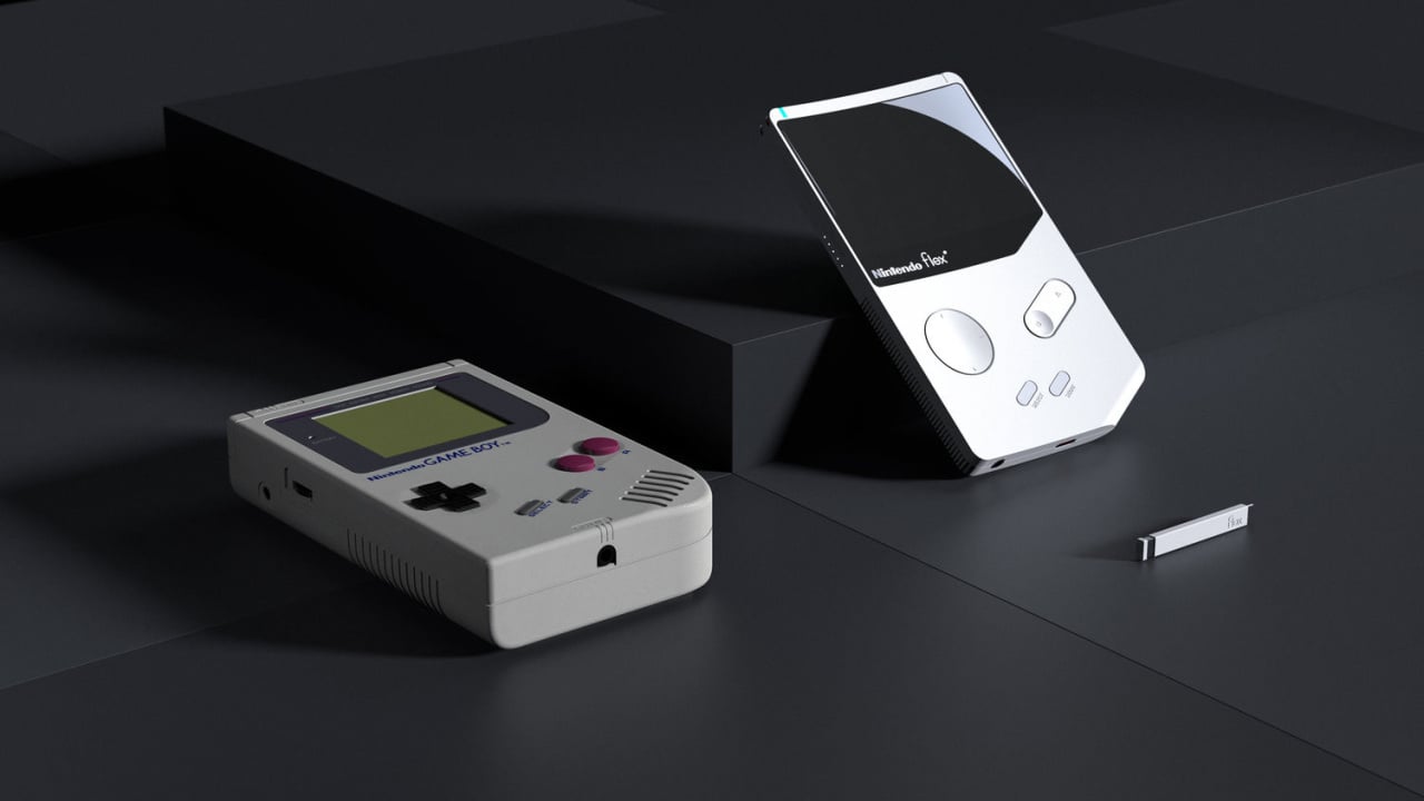
While we wait for Nintendo to sell us an official Game Boy Classic to complement the NES and SNES Mini, we cannot help our mind wandering. What might the classic 1989 Nintendo Game Boy look like if it were reimagined for our more – ahem – refined design sensibilities 30 years later?
Industrial designer YJ Yoon rose the challenge of taking the classic beige brick and refining it a way which brings it bang up to date. Yoon obviously has a lot of nostalgia for the humble Game Boy, as many of us do. "Playing with it reminds me of my younger memories," he says. "It was the first gaming console that I got as a birthday gift from my father. The feeling of the grip, pushing in and pulling out the game cartridges, and the analog gaming melody are still lovely."
He goes on to describe the design choices made in lots more detail here. The Game Boy Flex has a much thinner body and a larger screen, which we'd naturally expect in any redesign from Nintendo themselves. It looks like the concept captures the original feel of the handheld – but we're not quite sure we're ready to give up the classic D-pad just yet.
Have a look at Yoon's work and let us know if you'd buy one of these if they were available. With the 30th anniversary of the original Game Boy coming up next month, Nintendo still has time to surprise us by revealing the Game Boy Classic we've always wanted!
[source behance.net]


Comments 79
Clearly no.
Nintendo never went on such design, and even the switch is really far from such design.
i just actually picked up a modded backlight dmg myself starting my gameboy collection. so many games to play only had mario, tetris and batman when growing up before it mysteriously dissapered.
It's a lovely design - but vastly different to anything Nintendo would ever do. If this was one of those unofficial upgraded Game Boys you see floating around I'd buy one in a heartbeat though.
From the article...
"Acquired linear pattern texture on the lower half side on the back allows the excitement to play retro games. The feeling of subtle bumps on the texture with the debossed linear texture brings out the analogic memory, translating in attractive visual at the same time."
The first part is just complete waffly nonsense and massive grooves all over the back do not equate to gentle bumps and clashes with the sleek front of the device.
The less said about the button and the directional pad the better. There's no need to radically fix things that aren't broken. The only smart decisions here are to put the speakers near the top and maybe to lock the cartridge in whilst the system is switched on.
Those buttons look horrible to use. Luckily, those guys don't work for Nintendo and stick to crappy concepts that will never see the light of day
I'm glad this guy doesn't work for the gaming industry as he seems to have forgotten to put buttons and a dpad on it
This looks more like an Appleboy
"Here's what the Game Boy might look like it it was designed today"
That's called the Nintendo Switch or the 3DS.
Or if we lived in some alternative universe where Nintendo never made the Game Boy back in the 1980s, then:
Gaming as we know it would not be the same.
But even assuming it was, mostly the same - no one is gonna release a gaming device in 2019 with 2 buttons and a D pad. Certainly not a hideous D pad like that.
In a vacuum where Nintendo didn't design the Game Boy back then I imagine if they did it now it would look a lot like those mock-ups of the a "Switch-mini" or something along the lines of the PSP Go. With a full, modern assortment of buttons.
Thank goodness Gunpei Yokoi was around back then to design the GameBoy. The d-pad and buttons on that modern design are all form-over-function.
@Heavyarms55
So no GameBoy Classic in 2019?
LOL no, Nintendo don't go for modern slick look. They like dorky design, the epitome of their preferred aesthetic is this:
Nice! Flex that sh*t!
Weird flex but ok
Yeesh, those controls. It's nice from a purely visual standpoint, but would be completely unplayable.
That “d-pad” (if you can even call it that) is enough to test the item’s aerodynamic properties as it is hurled out the window....of a moving car.....driving near a cliff......with very rough seas.
@KingdomHeartsFan
No, I agree completely. The old consoles were iconic, distinct. Now? They seem to come in black, grey, and white and they all have very unremarkable designs.
Looks like the Game Boy if Apple designed it or something.
"if designed by anyone else" maybe.
Nintendo would never design something like that today. Just look the Switch for example. That's not Nintendo's aesthetic s
@Fandabidozi That'd be different, since they'd be recreating an existing design. This article suggests what would happen if it were something new.
Personally if they do go that route, I hope they skip the Game Boy Classic/Mini and go straight to the GBA, and release it with both Game Boy and GBA titles. (I mean, they probably wouldn't do that, because they could make more money releasing 2 devices... then again, they could be making loads of money releasing retro content on the Switch from a variety of systems, and they aren't doing that... so frak if I know...)
@SWiitch The original DS was pretty modern by the standards of when it was released. It looked a lot like PDAs and other pocket devices of the era. Especially the almost business like colors of silver/grey and black.
Nice. Reminds me of the GBA SP, which at the time was the nicest looking console around and still looks the business.
More like "what if Apple designed the GameBoy"
Among such negativity, I'm actually intrigued. And for a handheld that could have debuted today, it's actually far more plausible than any one of you could think.
There is no way this is even remotely close to what a modern Gameboy would look like if Nintendo made it.
I love that everytime someone tried to redesign a Nintendo product, they chose the most unfitting button solutions known to man...
Give me a proper D-pad and buttons. He also failed to at least make said pieces red and black.
It doesn't look anything like a Nintendo product.
the only way that would be a gameboy made today is if it was sony or microsoft making it....past will tell you nintendo doesnt do modern they do funky and wacky designs, ie gamecube N64 og DS, and so on.
The flat controls are ergonomically terrible.
Looks like a portable Intellivision or Atari rather than anything Nintendo would make. Nintendo loves their cross shape d-pad they would never opt for a disc style d-pad like that.
It’s called a smartphone...
That design looks really, really bad.
Pretty, but that D-pad is a disaster
@Tsurii at least i'm not the only one, that d pad is hideous.
I honestly rather he just stuck with the basic overall look of the classic design but made it about a third as think and maybe 30% smaller. And obviously have a better screen too, as long a batter life as humanly possible, and stuff like that. His design is still kinda cool though, if maybe having a bit to sharp edges for the most part. I think a little bit more rounded would have looked nicer and would also certainly feel nicer in the hand too.
The classic is always the best
put real buttons on it and it'd be fine imo.
or if they released a 'classic' that looked like the OG but was super thin. that'd be awesome. clean up the screen a bit, backlight it, heck; even allow OG carts to be used.
i'd pick one up.
LOL at that horrible D-pad.
I really like the overall aethstetic. I would love something like thos. But, yes, a proper d-pad and at least 4 face buttons would be required.
Attractive but looks painful to actually use.
Fun little 3D design exercise, though.
@ReaderRagfihs While I agree with you, it was just SO. TOP. HEAVY. though.
No d-pad? GTFO mo-fo!
Personally, I think a modern-day evolution of the gameboy would continue from the design on the gameboy advance and look like a classic ipod touch with d-pad, shoulder buttons and a b start select buttons. basic but simple. That's been the ideals of Nintendo designs.
It's a lovely design, though I'm not crazy about the flat a button and circle D-pad.
Umm..... No. It's... Just... No
I prefer a more classical/retro look.
This is something that bugged me for a long time. Why is there an aversion for the D-Pad (and clicky buttons in general) in anything non gaming. Most TV remotes have mushy "buttons" or these horrible radial "D-Pads", in cars the same with the steering wheels, why always these weird and always different controls where a D-Pad is obviously the best choice?
It's a cool design but I still would prefer a classic D-Pad. I hope Nintendo releases a Game Boy Classic. I'm sure the N64 one won't happen and the GB games did stand the test of time a lot better than the N64 anyway, as evidenced by the great games of the 8-bit and 16-bit eras on the NES/SNES Classics. Game Boy nostalgia is high and it would be great if Nintendo did this. That said, I'd want more than just 20-30 games on it. The GB library is HUGE. I'd love a lot of variety of first and third party games. Hopefully Nintendo could make that happen if they ever did release one.
If you want to make people hate gaming then is a wonderful design.
No D-Pad, no deal.
I would actually love another Game Boy.
Especially if it was that traditional shape.
It was a good place on time.
No d pad? Nah I don't think so.
They found a way to make a worse d-pad than the switch joy cons
Interesting, design does look quite sleek and techy.
Looks too thin though to be held comfortably though, at least by adults
It would look more like a GBA I'd think.
This looks cool! But to be honest my favourite looking Nintendo handheld is still the gameboy micro. It's sooo portable and sleek looking and those buttons are just perfect. I have an ez flash omega so my micro plays gb, gbc, gba and nes.
Lesson #1 in how to make a handheld look like it definitely wasn't designed by Nintendo, because it completely misses the mark and lacks that distinctive Nintendo look and feel.
It's to pretty to be designed by Nintendo lol
Well, that's ugly!
Were those buttons intentionally made to not look functional?
Haha! This looks like the N-gage! Horrible, bland design.
Nope, not a design for me.
"Here's What The Game Boy Might Look Like If It Was Designed By Someone Who Never Played a Video Game In Their Life"
FTFY
@BanjoPickles "The old consoles were iconic, distinct. Now? They seem to come in black, grey, and white and they all have very unremarkable designs."
Err, the NES, SNES, and Gameboy were all gray... The N64 was black--but came in a variety of limited edition colors as well.
All of the Mega Drive and Master System models are black (except for the silver Master System II) as were Ataris and Intellivisions (though these included faux wood grain!). The Turbografx was also black, except in Japan where it was pc beige.
So your comment seems to miss the mark somewhat, at least from where I'm sitting...
(tbqf, the Famicom is quite colorful)
Nintendo iBoy
@Wavey84 No way dude. The original DS looks way nicer than the DS Lite, which looks like a bloby mid 90s budget PC. And that glossy white showed every spec of dust, every finger print, and god forbid your hands ever sweat!
Hey, as long as the thing don't require four AA batteries for some five-six hours of play, it can look like the diseased colon of a dying donkey for all I care.
I'm not a fan of the flat and concave buttons. Buttons always work best when there's something physically sticking out for your fingers to actually press.
That D-Pad is the embodiment of pure evil.
wtf lol
No I cannot think of anything else to say
@Wavey84 We're totally in agreement on the screens - but that's a different issue entirely.
It looks cool, the there's a good reason no console controllers have concave d-pads or two buttons fused together in a single rocker switch. This thing would be barely functional with those controls.
That’s be cool if they made a gameboy “classic” and it’s small enough to fit in your pocket.
....wait.
... haha
@Plainclothes_Man
Haha! Touché! I guess what I meant was that there was something about the aesthetic that has stood the test of time. The design of the NES, SNES, Mega Drive, Atari 2600, and PS1 were iconic in that even the newer generation of gamers can name them. Will the same be said for PS3, PS4, Wii, Xbox One? They just seem so aesthetically boring, in comparison.
This is what an apple Gameboy would look like
It's beautiful.
Looks nice but Dpad looks rubbish certainly no good for 2D games. Regards to design Nintendo purposely make things more robust to take a bit of stick from heavy handed kids.
Well, I wouldn't have thought the D-Pad would ever get redesigned and especially like this. Same with the buttons being flush.
I'd love something like this by Nintendo (with standard buttons, D-Pad) which allowed Gameboy games from all generations to be downloaded. I've said it for a long time, though I doubt many on here remember me saying it. I'd love a slim designed Gameboy similar to a smartphone in size (them bigger models tbh) that just had an online library of games to download and take anywhere. That would be a dream come true.
Nintendo never went the high tech look for it's devices. Clearly random and clickbait.
@Heavyarms55
No! No different! Only different in your mind. You must unlearn what you have learned.
Tap here to load 79 comments
Leave A Comment
Hold on there, you need to login to post a comment...