
Welcome back to Box Art Brawl, the weekly vote where you decide which retro regional box art variant wins in the beauty stakes according to sophisticated modern tastes. Oh yes.
Last week Castlevania for the N64 entered the ring in a third appearance for the series and one of the closest fought brawls to date. In the end Europe just edged a victory over Japan by a mere 3% while North America trailed far behind with just a tenth of the overall vote. We guess you weren't fans of Reinhardt's bushy eyebrows. Congratulations to Europe, but we're certain we haven't seen the last of Castlevania round these parts.
This week is a real gimme; possibly the biggest foregone conclusion in the history of democracy, but we've delayed it long enough. Perfect Dark for the Nintendo 64 was given a different cover in each region, an interesting story in itself which we delved into last year by talking to former Rare Art Director Kev Bayliss. However, today ours is not to reason why. Today, we're just voting for our favourite.
C'mon then. Let's get on with it.
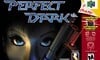
North America
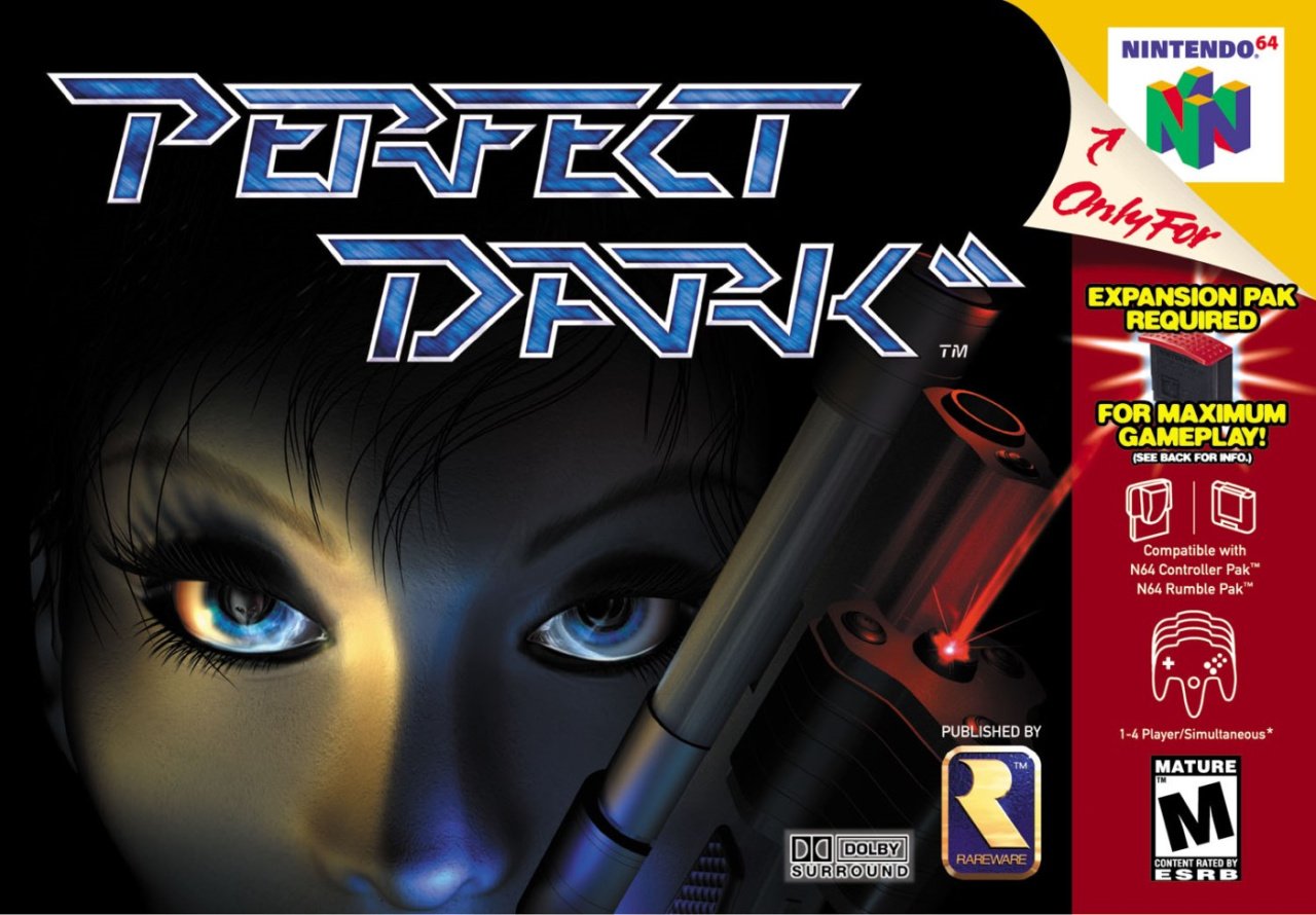
North America got a close-up of Joanna Dark's CG face with Elvis, her alien chum, reflected in her right eye. Strands of hair flick down over her brow and we like the lighting that suggests she's hidden in the shadows, waiting to strike. The gun barrel looks particularly clean as it breaks into the frame and who doesn't love a sexy red laser beam? It makes us think of Arnie's gun in the first Terminator movie. That's a good in our books.
The game was compatible with most every 'Pak' made for the N64, as you can see from the red strip down the right side. The slick logo sits prominently against the darkness at the top and that little gold Rareware logo gives us the feels, too. It's dark but still colourful. Not bad, not bad.
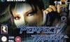
Europe
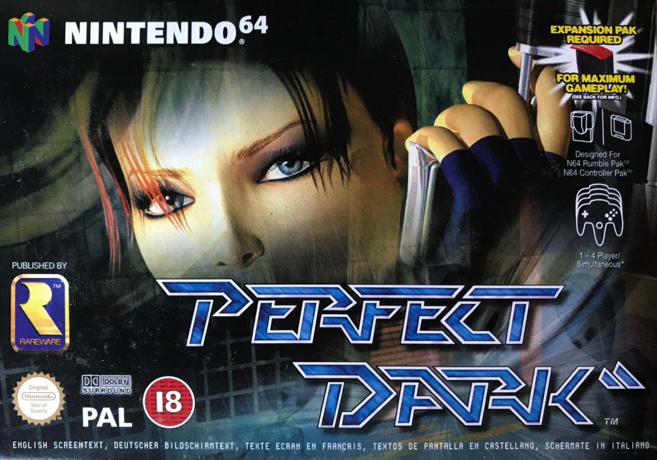
Looking absolutely nothing like the in-game model for the character, here we get the more sultry CG version of Joanna Dark (essentially Lara Croft moonlighting as a secret agent) and the bottom half of the gun we saw on the North American cover. It's still dark, but the face fades as several images are layered behind ol' Jo showing various structures and what looks like level geometry. None of it is particularly easy to make out, although you can see Elvis and one of his Maian mates.
The usual black border common to Nintendo's N64 output in Europe is gone here with the info displayed over the main image. Same logo as the North American variant. Again, it sets the scene nicely. Not bad, but it's all a bit immaterial, isn't it...
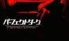
Japan
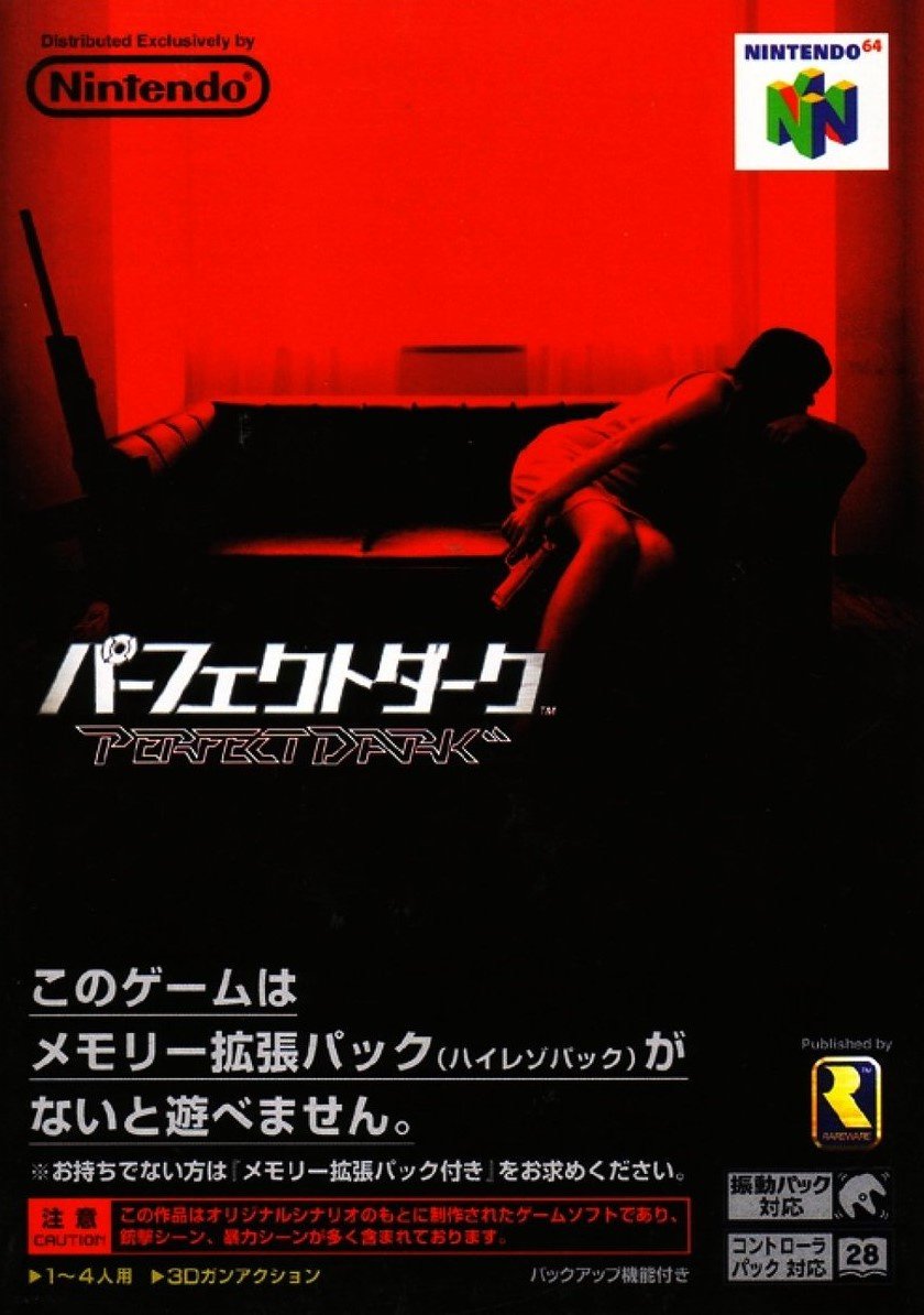
Game over, man. Where's a gif of Homer Simpson dribbling when you need one?
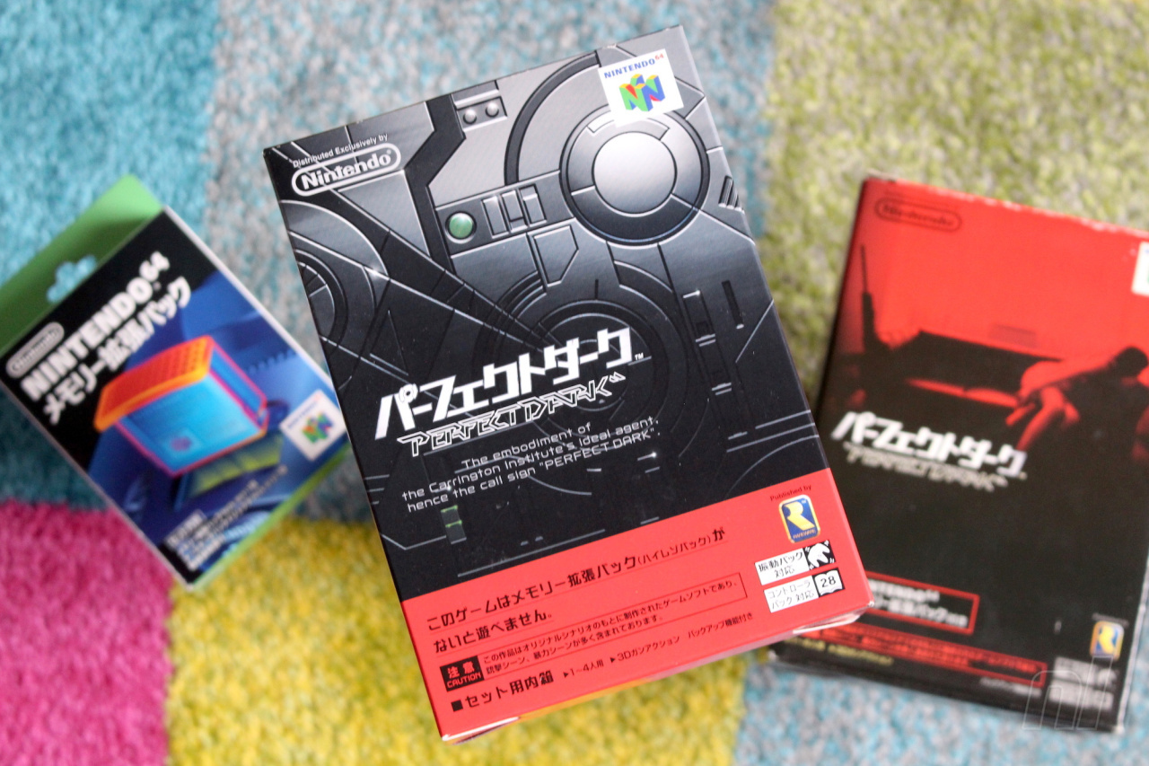
If you really wanted to nitpick you could argue that the game cover inside the big box which contains the game and Expansion Pak is rubbish, but in our experience gamers don't like to be pedantic like that. Here it is all the same, though:
Ah, there you are Agent Dark! Just in time to click 'Japan' below and hit the vote button:
There will be people who don't like the Japanese one - that's absolutely fine! Everyone is entitled to their opinion and we welcome all to Box Art Brawl! There's only one right answer, though... We joke! Ha!
So, tell us why you voted for Japan below and we'll see you next time. Stay safe, lovely people!


Comments 71
Euro version wins by a large margin. The US cover is not terrible but lacks something while the JP cover looks something out a rejected movie poster.
Europe box covers have been amazing these past few rounds
NA all the way. Clean. Simple. Direct. Hey, (!!!) speaking of Direct, when will we get a.... nevermind.
Well, the japanese one definitely is "perfect dark" in a certain way...
Euro one is my pick (and no horrid black border!). American one being second.
I agree with @peachflavored that the Japanese one looks like a bad movie poster.
European is the best, and Japanese by far the worst.
I don't like the Japan cover at all. The North American and European cover are pretty close but I ended up giving it to the European one.
The North American box brings back nostalgia. I didn't even realize Elvis was in Joanna's eyeball there! But that Japanese box just feels cool, and would have definitely appealed to me as a teenager.
I think the US one was used in Australia right? At least that's what I seem to remember. It's my favourite here.
Japan looks like the poster for a very risque film involving guns being used in... the only non-violent scenario you could really put a gun in.
Not judging anyone who would be into that of course!
That Japan one is beautiful and mysterious and enticing. I want pd on switch x x
The Japanese box art looks very sexual!
Avant-garde, monochromatic Japanese art wins me over this time!
I like the Japanese boxart but I don't see how it reflects the game at all, it looks like it would be better for a project zero game.
Europe by a mile for me.
Europe. The Japanese cover has almost nothing to do with the actual game imo.
Japan one by far. Very stylistic and fitting. Love how silly people are being here, not voting for it because it looks sexual xD. Wouldn't even call it that, sensual, enticing, maybe, but come on it's just a game cover from 2000.
Could go either way with US/EU. A middle ground between the two approaches would have made boxart history.
Voted USA out of spite
Japan looks beside the point. Even though the game was designed as an action movie, it tapped more into sci-fi than film noir. USA uses a barely human-looking model that doesn't remotely look like Joanna Dark (in-game or the hd renders in the promos).
Europe is overpacked with logos and captions but represents the game better in my opinion.
Europe of course.
I voted NA because I NEVER NOTICED THE ALIEN TILL NOW
I voted the NA, but the European is fine too. Japanese is by far the worst.
Any time a video game is presented as a movie on the shelves is a winner for me, though I grew up with and still absolutely love the European boxart, there's no denying how mysterious and downright cool the Japanese one is. And it gives almost nothing away, just like the Heavy Rain boxart released in Japan that is hands down the best!
Yeah Japan wins it for me. Looks like the opening shot of “The Conformist” . Very cool.
This was one of the games I missed out on back in the day. Both US and EU looks pretty good, hard choice for me. JP looks like a cover of a scary movie.
Didn't we do this one before?
I like the American version the most.
Don't like any of them.
The japanese version doesnt even look like its connected to the game, in any way shape or form and looks like a poster for some erotic tinged Z grade thriller.
The European version is just a CGI mess
USA it is.
@conditionals yep, usually Australia gets the classier European covers instead of the cheesier US covers, but this time we got the classier US cover. Bargain!
Still if you like classy there's no beating that Japanese cover. Drool indeed.
So we're all supposed to prefer the Japanese one based on the write up? Why? It looks so lazy and unappealing, in my opinion. Not that the other two are great. I think Europe wins this one.
I don't think I've ever seen that Japan cover before, unless I blocked it out of my memory. In any case, what a terrible boxart for the game. It looks like it's about depression or something. How is it winning? Unless people are being ironic...
The Japanese cover looks like one of those generic pics newspapers use when they do reports on sex trafficking. Not a fan of it at all. I’m voting NA this week - first time in ages.
I don't get it. What's so good about the Japanese cover? It's got nothing to do with the game and it just barely qualifies as titillation.
None of these are great, but Japan is every bit as not great as the other two. I feel like I'm being trolled.
@Krull
Haha, so true. Such a weird choice of image.
The Japanese box is pretentious. I laughed out loud when I saw it. Just terrible.
The North American one wins in my opinion. Although just barely in front of the European box.
"Yeah, we know it's Japan" Hahahahaha! Way to guarantee all the contrarians show up to dissent!
Not me, though. The Japanese Perfect Dark box art might be my favorite for any game ever. It's got this awesome, dark, Fin de Siecle energy that's spellbinding and hypnotic. It's a work of art. The other two are fine, but they're just box covers.
@StephenWolf
Or just people who don't like it, because it has almost nothing to do with the game its slapped on to.
Just that it's mostly dark and has guns lurking around.
@JasmineDragon
Was probably switched out by mistake for a Japan only horror game.
@KitsuneNight Hey now, it's got a girl, guns, and a room. Perfect Dark has all those things!
All are pretty good, but Japan is definitely the most classy, so I went with that.
Suprised Europe is outpacing NA at the rate it is though. They're both good, but NA looks just a bit more focused & clean.
the EU one, the American one is almost as good but i think the EU one packs more of a punch
but the Japanese one doesn't feel right for the game, it's a good box art but it feels more like a survival horror game not a FPS
North America wins this one for me, followed by Japan and then Europe (not saying the latter two are necessarily bad).
Honestly I don't think any of them are all that great.
Are you kidding with this foregone conclusion thing?! There is way too much red on the Japanese box, and you can't see Joanna's face. North America all the way this time!
I knew from previous Brawls I don’t agree with the taste of lots of people around here (when it comes to box art), but how Japan isn’t walking away with this one I’ll never understand. Oh it doesn’t reflect the game, it’s too red (never heard any complaints about NA N64 boxes always having a red strip regardless of the rest of the box), you can’t see her face.... seriously what?
"Yeah, we know it's Japan"
Goes to show you how little you guys know...
European version, by a LANDSLIDE, no: several landslides.
Cleanest design, best picture, which actually looks like it's drawn by a good artist.
The US version is okayish, but it has a far simpler, and in my opinion less attractive image, and it has the ugly red vertical bar on the right.
The supposedly "superior" Japanese box art looks like a poster for an art house movie about some obscure topic like drug or alcohol abuse, or illegal trafficking of women, but it has NOTHING to do with the game, so unless I put on my existentialist thinking cap, I'd be hard-pressed to see something even remotely akin to Perfect Dark in there. Completely forgettable.
On a side note: looking at the current score, either the crew of NLife is making sure that the JAP cover will win, or they have succeeded in influencing a bunch of hapless members, who've been duped into thinking that because of this article, the Japanese cover simply MUST be the coolest, and as such, they've voted for it, even though they're largely still wondering why the hell they didn't just vote for the US or EU cover instead.
@GravyThief Well, although I respect personal opinions, so to each their own, of course, I'd still expect/would want to see at least SOME part of a cover pointing to/referring to the game that it's supposed to be about. If you show this picture to people not in the know, and then give them a multiple choice question about it, I'm pretty sure that 9 out of 10 will NOT choose the answer "this cover belongs to an N64 fps game called Perfect Dark"...
(edit: if not 10 out of 10)
I love the Japanese style but I feel as though the North American box art reflects the type of game it is best. What with it being a FPS and the subtle image of Elvis as her focus. Thematically I believe it is the best representation although the 3D model has aged.
Box Art Brawls Current Total:
Europe: 11
Japan: 12
North America: 11
@ThanosReXXX I suppose that point of view doesn’t even come into for me. When I see the cover to Japan’s Perfect Dark, I see one of the best videogame box arts ever made. It just looks so good, especially for the time. But to each their own, as you say 😀
@dartmonkey "...but in our experience gamers don't like to be pedantic like that."
This made me chuckle lol 😄
If you were simply trying to sell a game and not advertise it, Japan's the best. Its mysterious and sexy. I would have bought it based on the cover art alone.
I never thought the NA box art looked bad, but it's easily the worst of the three. I'm kinda torn between the JP and PAL art. I think the PAL art fits the game the best, but the JP art looks cool enough to frame and put on a wall.
@GravyThief Just out of curiosity: WHAT exactly is it, then? What makes it so good in your opinion, and how do you think it relates and/or sets the stage for the game or not?
@ThanosReXXX it looks really good, ‘stylish’ if you will. I like the red/black colour scheme. It has a woman in it, that relates enough to the game for me (isn’t a man playing the banjo, for example). Doesn’t have a dodgy close up CGI face looking back at me. Could be the casting couch (automatic win).
@GravyThief Casting couch for being a special operative?
Fair point on that weird old geezer and banjo cover, that one was also weird, but still. Next thing you know, they're going to put fighter jets on a cover of a Ninja Turtle game, because, you know, even though it has nothing whatsoever to do with mutated turtles, it's just SO stylish and all that...
I'm sorry, but no, just no. Oh, well. To each their own, I guess.
On a side note: the dodgy CGI face is the American cover. WAY too aged, even for that time. The EU cover image actually is fitting for its time. I'm suspecting besides youthful/personal sentiment, that a lot of people are also looking at it with 2020 glasses, and that'll definitely f-up any objective choices as well...
I’d say the Japanese art looks the most creative, but the European version is the most accurate.
Europe in this case. I don't even know what is supposed to be seen on the Japanese one here...
EU the best. JP is a mess of red and black. There's nothing there. Curiously, Australia, a PAL region, got the US box. I've noticed this with a few other games too.
@ThanosReXXX my casting couch comment was a failed attempt at humour! I don’t think I could vote for any fighter jets on a TMNT cover, no matter how stylish they were, because the Super Famicom version of Turtles in Time exists, and that cover is just great.
I tossed my vote towards the European cover.
Dang, Japan's is awful, and not even in a "so bad it's good" way like some cheesy boxarts are. NA for me, Europe isn't too shabby either though.
@DreamerDC agreed, it was hard not voting for those legs but it's way too much red
@GravyThief Well, there you go...
As for the joke: my bad I missed that.
To be honest, I don't really like any of them
In the Japanese cover it looks like she's about to kill herself.
Japanese cover looks really cool. Like a spy hiding after a sniper attempt went wrong. Makes it look like a movie.
The Japanese box is awful. Naturally, it wins.
The Japanese art doesn't even represent what the game is about. It's just a woman sitting on a couch with a gun. No aliens or sci-fi elements whatsoever. Easily the worst choice here.
I voted NA.
@GravyThief Those are legitimate complaints! A red strip is nothing compared the monochromatic mess of color covering the entire box that the Japanese somehow thought was a good idea.
I voted for the North America cover art for its simple, focused emphasis on the "Dark" theme of the game. However, looking back, I wish I could retract that vote and give one for the PAL version, instead. Makes it seem very hi-tech, and Joanna's CGI model is amazing.
The Japan box art is actually the worst out of all them. It tells us nothing about the game at all. Elvis isn't present, the read and black aren't used effectively, and it's a woman standing on a couch with a pistol at hand and a large rifle at the side. What does that have to do with a plot which involves two government agencies at war with extraterrestrial elements thrown into the mix? Japan doesn't always have the better box art, and it being from Japan doesn't automatically make it the best out of the three.
EU. The Japanese art doesn't tell you what the game's about, and the North American art has a huge red border on the right (like all NA N64 games) and oh my lord what is that thing stuck on top of her gun?
Tap here to load 71 comments
Leave A Comment
Hold on there, you need to login to post a comment...