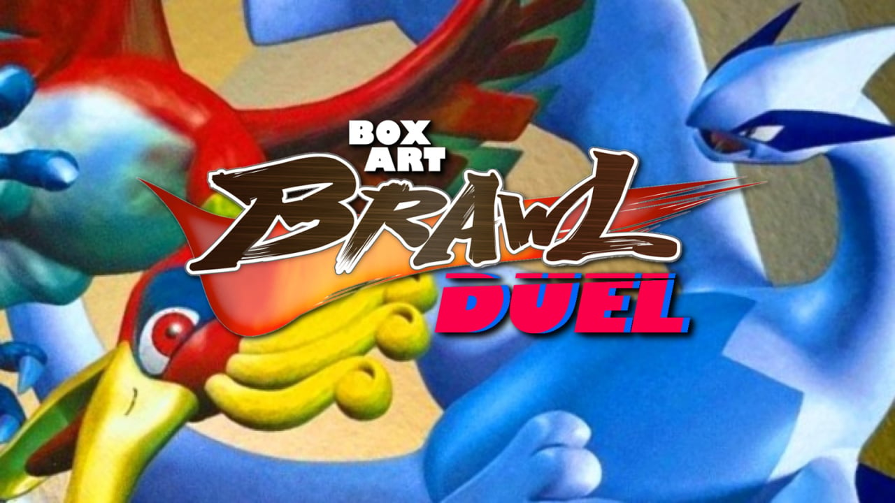
Welcome back to Box Art Brawl, the contest where we pit regional box art from around the globe against each other in a deadly fight for your vote. We exaggerate — it isn't deadly in any way, shape or form, it's just a box art poll. We love a bit of drama.
Last time, Super Ghouls 'n Ghosts fought a battle between East and West. Eventually, the East emerged triumphant with over 60% of your votes; a victory that the West gracefully acknowledged and accepted in the most sportsmanlike fashion. Good game, everybody.
This week we're pre-empting the 20th anniversary of Pokémon Stadium 2 for the N64, which launched in Japan two decades ago on 14th December 2000. The game — the third Pokémon Stadium release in its homeland, and the second in the West — enabled N64 gamers to slot their Pokémon Red, Blue, Yellow, Gold and Silver carts into Transfer Paks and do battle on the big screen in full 3D. For Poké Trainers who had been used to playing on a diminutive Game Boy screen, the Stadium games were a remarkable opportunity to see what their Pocket Monsters 'really' looked like.
Enough chatter. A pair of wild video game covers appeared!
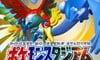
North America and Europe
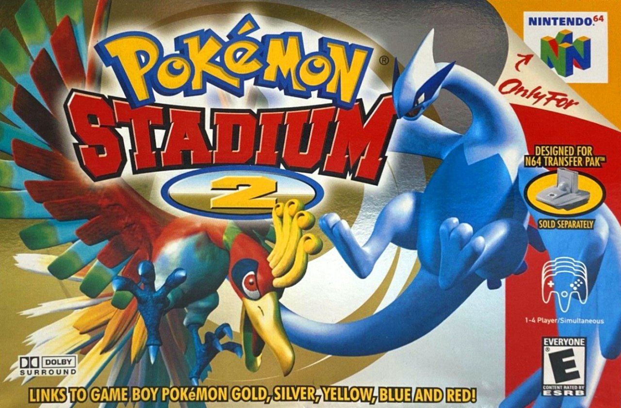
We begin in the West with a cover that was more or less identical both sides of the Atlantic. Ho-Oh and Lugia circle one another against a spiral of snazzily reflective gold and silver while the big ol' logo butts into the middle of their brawl with a '2' that looks a little squashed to our eyes.
This is a workmanlike effort that gets in there, does the business with the minimum of fuss, and gets out again. The shininess of the background is certainly effective, although we wouldn't say it's super effective.
Japan
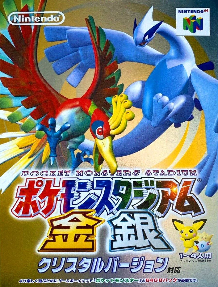
The Japanese cover uses the same art, but reframed in portrait with the logo moved to the bottom. Pichu and Togepi cameo above the 1-4 Player notice and the logo has a natty effect that fades between colours relating to all the Game Boy Pokémon titles supported (Red, Green, Blue and Yellow in Japan, remember).
While it uses the same main art, we much prefer the spacing and details of the Japanese variant. Still, it's not up to us, is it?
So, you've seen both covers, but which one is the very best, like no-one ever was? Which Pocket Monster wins? Pick your favourite and hit 'Vote' to let us know below:
We're well into December now and the end of 2020 is in sight! Stay safe everyone and we'll see you next time for another Box Art Brawl.


Comments 36
Was going for the EU/NA one before I read about the logo details for the Japanese one which I really like, so that gets my vote now. They were really close anyway as there's not really THAT much of a difference but that detail did pull it ahead just a bit.
How would someone argue versus japan’s masterpiece
They are basically the same box but I voted for the Japanese one since it has fancier logo. The gold and silver kanji look nice unlike the number 2 in US/EU box.
I don't play N64 games but that Japanese cover looks a bit better than USA version + the design is vertical like standard video game packaging.
"Corporate needs you to find the differences between this picture and this picture."
The japanese one looks a bit more dynamic, so that one.
Can we get two different box arts next week? These are basically the same! That said, I voted NA/EU because it doesn’t have that weird, glassy-eyed Pichu on it!
They both suck, I refuse to vote.
Both are terrible. I've seen better art come out of me, literally.
I voted for the Japanese art work, I definitely prefer the portrait view of the cover.
It’s the same art it’s just a different layout forced by the different box sizes. So my vote goes to both and neither.
Before I even saw the Japanese box, I thought the western box had poor composition with the logo right between the two monsters. The Japanese box has much better composition and spacing. As a bonus, they threw in bonus cute stuff in the bottom right.
They are pretty much the same so I voted for the European one as its the one I had.
Cue the "they are the same picture" meme
Jokes aside, the japanese logo is really nice but I was raised to like frames in my boxart. It just isn't the same without that big red stripe reminding us it's a game for the N64.
The logo is much cleaner in the american version.
A little trivia.
What were released internationally as Pokémon Stadium, and Pokémon Stadium 2, were actually the 2nd and 3rd games.
There was a first Pokémon Stadium game released exclusively to Japan. It wasn't released internationally because it only featured 42 Pokémon for battling with.
It's impossible to choose really. I went with the NA/EU one because it has what I recognize as the Pokémon logo l on it. It's an arbitrary excuse.
Japan, but only because of that Pichu, and that I would definitely place Pichu pretty high on a Top 5 cutest Pokémon list.
Japan. The artwork was clearly designed to be viewed in the portrait orientation, so things look a bit more squished & cluttered in the US variant.
Box Art Brawls Current Total:
Europe: 25
Japan: 28
North America: 27
Japan by a mile. This is a great example of how small design differences can have a huge impact. The art is the exact same, but the NA/EU version is cramped and busy, while the Japanese version soars.
The Japanese version looks better to me, plus it says at the bottom that it supports Crystal Version.
I’d say that Japan takes the W this time.
I remember the Australian release was called Pokemon Stadium GS.
@FX102A : It wasn't though. It was called Pokémon Stadium 2 just as it was elsewhere in the West.
You might be thinking about the "GS" logo that was used on the packaging of some Gen II games, but the only evidence I have found indicates that the "GS" logo was only ever used on the American packaging of Gold, Silver, and Crystal, not the Australian releases (though for some reason, the "GS" logo was embedded in my memory as well).
I think this is the first time I abstained from voting because neither one stuck out to me as a clear winner.
North America/Europe this time for me, Pichu and Togepi sitting in the corner of the Japanese one is what ruined it for me.
This just makes me want Pokemon Stadium 3
Gotta vote with the one with the most Pokémon. Which turns out to be Japan.
They are virtually identical.
These were great games. Too bad only the older generation got to experience them.
While the logo for the Japanese one is clearly better, I voted for the NA/Europe version based on stronger overall composition. Japanese one felt a little busier, and I liked how the NA/Europe version integrated the logo into the art.
Japan. Both kinda ugly though.
I don't like either of them
@daftfunk It was released the same day as Crystal Version in Japan, so it'd be silly if it didn't.
This is one of those times I wish there was voting option for a tie
Tap here to load 36 comments
Leave A Comment
Hold on there, you need to login to post a comment...