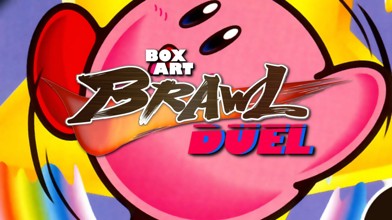
Welcome back to Box Art Brawl, our weekly poll to find the best regional box art variant from two or more retro candidates.
Last time we looked at The Legend of Zelda: Spirit Tracks in a duel that pitted Japan and Europe against North America. It appears that the regional team-up worked wonders — the greenery of the JP/EU cover pulled in a stunning 86% of the vote.
This week we're taking a look at a Game Boy Color title on the 20th anniversary of its North American release. HAL Laboratory's Kirby Tilt 'n' Tumble came in a special pink plastic cartridge and used in-built accelerometers to control the Kirbster in a quirky motion-controlled adventure through Dream Land. Once again, this is a two-way bout, although Europe is sitting this one out — the game never released in that territory, unfortunately.
So, let's see if ol' Angry Eyes is back...
Japan
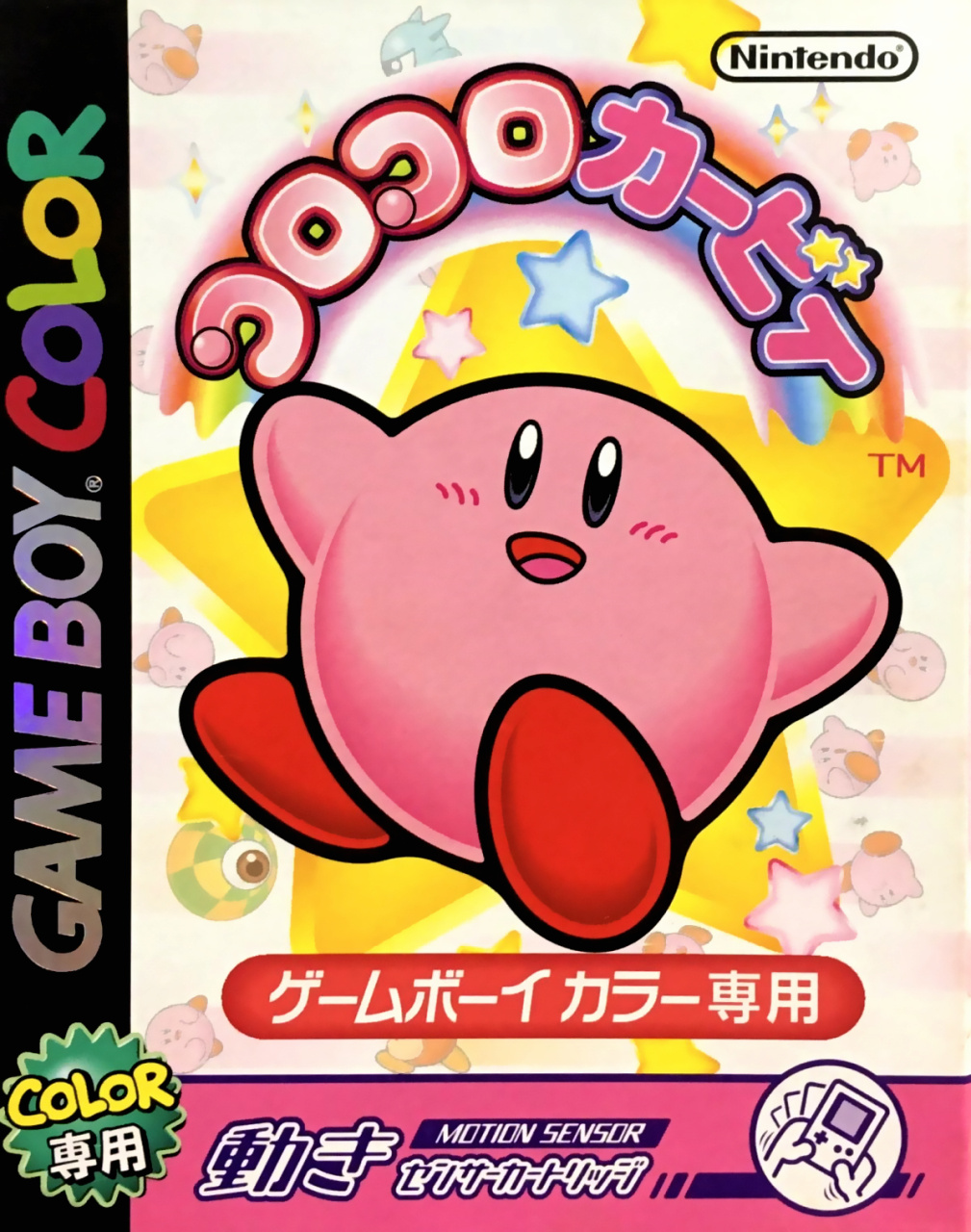
Big old Kirby + big old star = BOOM. The Japanese cover keeps things simple and goes for impact with Kirby in the centre against a white background featuring various faded images that don't distract from the star of the show.
We like the classy black strip down the side with the silver GAME BOY logo which catches the light. We also like the little motion control icon in the bottom right corner. A nice, solid Kirby cover.
North America
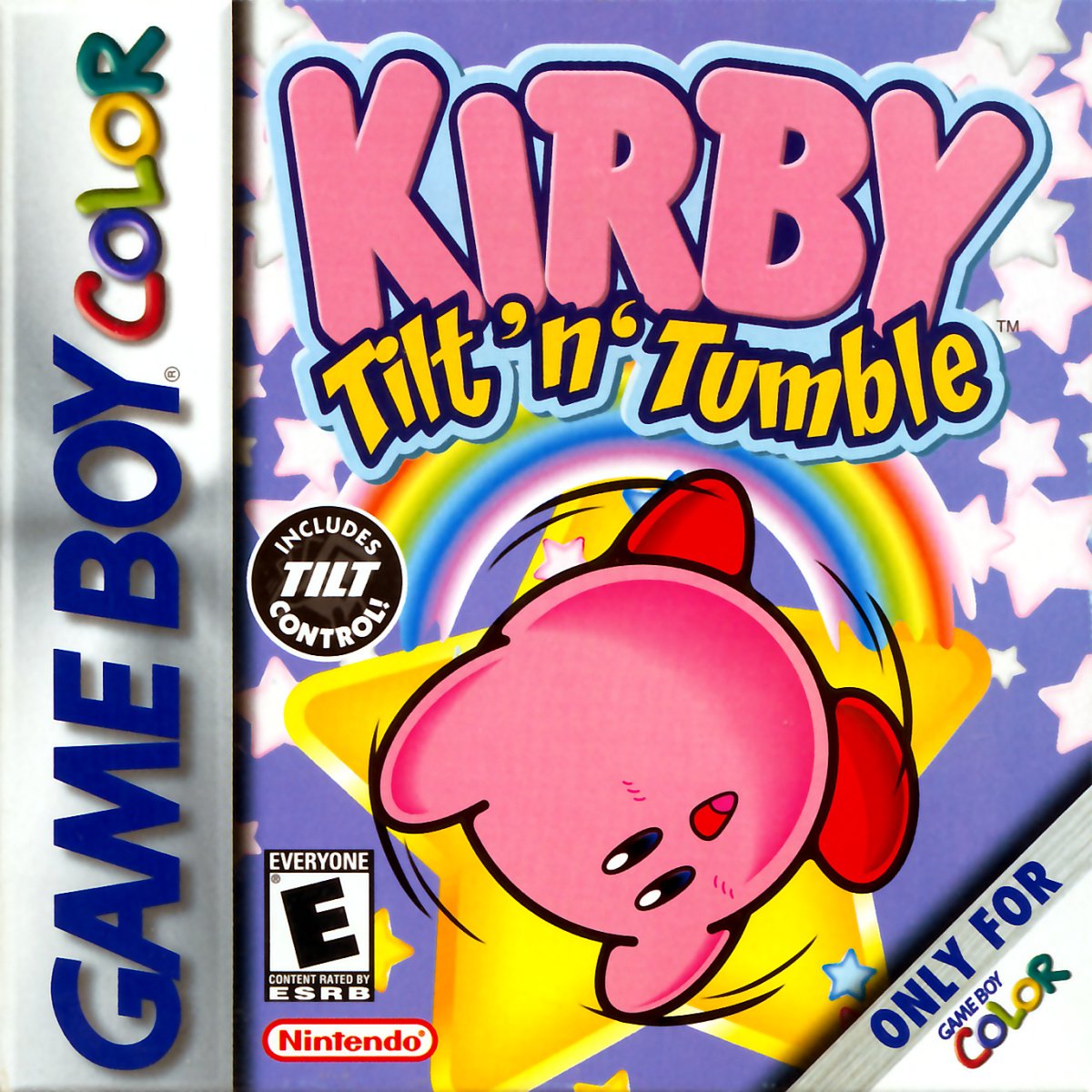
The North American logo for the game takes up almost a third of this square box, with Kirby tumbling just below — presumably having been tilted moments before. It's novel to see the character upside down on the cover, and perhaps even more unusual not to see the patented 'Angry Eyes' the character is often given in North America to 'toughen' him up. Or something. There's only so much attitude you can give a pink marshmallow with red shoes.
It's a fun cover, similarly bold, although somehow bland, too. The flat shading of the logo gives this a plainer feel than the Japanese version, and the repetition of the Game Boy Color logos up the side and in the bottom right corner feels a tad superfluous. Why not add a tiny 'ONLY FOR' in the bottom left corner instead?
So, you’ve seen the two options, but which Kirby is going to suck up your approval? Click on your favourite below and hit ‘Vote’ to let us know:
Happy 20th Kirby T'n'T (the NA version — Japanese Kirby Tilt 'n' Tumble turned twenty in 2020)! Have a great week and we'll see you next time for some Box Art Brawlin'.


Comments 35
Honestly, I love them both. But slight edge to North America, since it's more clear that Kirby is "Tilting". Then again, I like the Kirbys in the background of the Japan box art.
Includes Tilt Control
I went with Japan but like both.
Is the word "Game Boy" on the Japanese one shiny and reflects in the light? 😲
America, I like; the Kirby box art that is!
that game looks so cute!
Tough one this week. I like them both.
Both good, the Monk inside of of me wants the Japanese one haha
I vote for the one with actual tilting and tumbling on.
Fun game once you get used to the often imprecise handling. Though my save file is stuck at 99% and I have no idea why.
Box Art Brawls Current Total:
Europe: 28
Japan: 31
North America: 34
Australia and New Zealand: 1
North America one because for once Kirby isn’t mad on it
I have the Japanese version of this game, it never got a release in Europe and it was the one I could find in the best condition for a very good price. I'm surprised Kirby doesn't look angry on the US box art. I'm not voting, because they're both just an image of a happy Kirby with some stars and stuff on the background, and too much text and icons.
You think the NA cover is bland? The Japanese cover is the much blander of the two! North America gets my vote this week.
Also went with japan, but also really like them both.
Whilst they're both good, they have about the same level of detail.
Though the Japanese version shows off some background characters, the American version shows off Kirby doing a tumble.
It's not much, but it's the only thing indicating what you actually do in the game.
Honestly, neither cover looks all that great, with that said I voted for the North American boxart.
Neither is great, they're both way too busy. Slight nod to the NA version because the Japanese one is so generic it could be for any Kirby game.
Voting for North America, only because it actually lacks angry eyes Kirby.
These are both great. I picked Japan because I actually prefer the title in Japanese: Korokoro Kirby is cute and alliterative (a deadly combo!)
Both are nice. I like the little Kirbies in the Japanese art rolling around. I also think the Japanese art has a nicer disclaimer for including tilt controls, as opposed to the uneven, black US art, which is not really looking for matching the tone of the rest of the boxart. But then again, the “COLOR!” disclaimer seems redundant on the Japanese art, since the cover already implies its exclusive for the GBC.
Japan. The colors are vibrant and there are little kirbys flying around in the background.
Just look at Kirby falling from the sky! The player must not be very good.
The Japanese one seems a bit more like generic Kirby art. The American one tried to represent the game a bit better, so it gets my vote.
Poyoh! I mean, NA!
Im going with the NA version. It fits in with the overall feeling of the game again.
Neither box looks like it contains a very fun game. NA box design is a hot mess. At least the Japanese box has some balance to it.
North America wins for me. Kirby looks like he's actually tumbling in that design.
I like both. They're simple, but they're nicely done, mostly. The NA cover is a bit overly busy between the background, logos, and labels. I think the Japanese cover has better overall composition which is the deciding factor for me on this one, so I voted Japan.
I can't vote today. I like them both equally.
The Kirby's are fine but I don't like the labelling of the US Gameboy Color box art. It's too busy, I don't know where I'm supposed to look. It's a better image without the white corner torn out or the great big E from the ESRB rating on the cover. The Gameboy Color logo column on the left is wider so there's less room for the game's actual picture, and the white column blends in with the light kirby background whereas a dark banner provides better contrast. The word COLOR is used twice on the cover and it's ugly each time with it's 3d and shadowed lettering that looks like bad early 3d animation or something, while the Japanese one just looks like a colored marker on a black background, not trying to be extreme and edgy but instead matching more the aesthetics of Kirby and what a Gameboy Color is actually capable of.
And also there's shadows on the column and shadows on the thing in the corner and the words "GAME BOY" have shadows as well as if to give the impression that it's 3d, but it's really just a Gameboy Color and not capable of anything like that which is a bit deceiving, and it's also taking up even more valuable space reserved for the the Kirby game image.
This one was tough. Having never played the game, both covers are foreign to me.
While the NA cover seems to covey the “tilting” aspect better, the Japanese cover has more charm so I went with it.
I think that's the happiest America has ever let Kirby look.
NA. Kirby is tilted and the art is brighter.
Gotta ditch North America this week! I much prefer the one from Japan. Something about the colors and gone make me want to play that game. The other one makes me want to pass on trying it. Helps that my heart is in Japan.
@Nintendo_Thumb They needed to REALLY make sure players knew which games were GBC-exclusive and which had monochrome compatibility, from just the front cover art. There were some stores, like Target and maybe Walmart, which didn't make it easy to see the back boxart when looking at the games on the shelf (they'd lock them behind glass, so you'd have to ask someone to let you look at the rest of the box).
North America for me as there is simply more overall artwork to it. Also Kirby actually "tumbling" in the gamebox art helps win this, ha.
Tap here to load 35 comments
Leave A Comment
Hold on there, you need to login to post a comment...