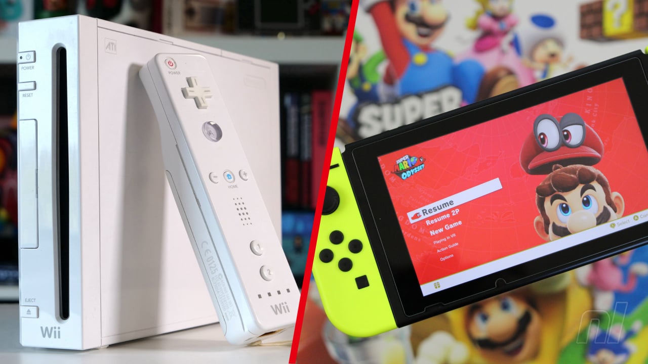
We all remember the start-up animations from the Wii home menu, right? You'd select a game, see the icon fill the screen and then watch a short animation (accompanied by music, of course) while you chose whether to start the title or head back to the home page. We miss them.
For many of us, these menu animations are deeply ingrained in our heads for the likes of Smash Bros. Brawl, Skyward Sword and Super Mario Galaxy, but what would things be like if some of the Switch's finest titles got the same treatment? That is the very question that YouTube channel Pineapple Puppy has attempted to answer, as they built Wii-style menu animations for a whole bunch of Switch games and now we're feeling all kinds of nostalgic.
The titles span the entire Switch catalogue, with the animator making brilliant short intros for the likes of Super Mario Odyssey, Mario Kart 8 Deluxe, Captain Toad: Treasure Tracker and many more. You can find the full video below.
Of course, with so many Switch games brought over from older systems, there was bound to be a certain level of crossover (the Breath of the Wild one is near-identical to the game's load screen as found on the Wii U), but many of these are completely original creations and immediately capture the vibe of the Switch game with all of the nostalgia of the Wii's menu style.
Turning back to the Switch is going to feel a little quieter now, but let's hope that the console's successor carries a little more personality on its home menu — or at least gives us some better theme options...
What do you make of these Wii menu mock-ups? Let us know your favourites in the comments below.
[source youtube.com]


Comments 42
Man the Switch’s menu is so dull. These animations are primitive, but they are missed 😪 along with any kind of ambient sounds and noises.
The switch is a great console but so freaking soulless and boring. The Wii had so much personality.
That's an impressive WiiU hard drive to have those all loaded, ready to go like that.
Wow, some of these are pretty simple but the effort it took to recreate the Smash logo flying in-in particular, was impressive
Ah! The music and titles appearing for Luigi's Mansion 3 and Paper Mario! Those boot up menu animations would have hyped me up more to play them if existed irl.
I believe the correct term for these would be Channel Banners, as the Wii's home menu had "Channels".
Not sure why this is such a big deal to some, you click on an icon/thumbnail and play the game...
As long as the icons look good it does not bother me , the Switch home screen is simple and fast, this is the most important thing.
I'm not sure why this feels so nostalgic, I only had a wii when I was very young
Xenoblade where?👹 Especially since the first game started out on Wii to begin with?
But seriously, great work. I enjoy similar elements on PSP and 3DS as well, although their absence has never been any more of a dealbreaker than themes and whatnot. Not sure how it drives some to call Switch "a soulless and boring console" without smelling the distinct FWP stench of such hyperboles. I, for one, don't quite use consoles for "personality" myself (it's GAMES where I expect to find any), but in Switch's case, its very hybrid modular nature, with all the different controller configs, modes and the trademark magic of the ongoing game session "leaping" between the built-in screen and the TV, is arguably where its personality really lies. When I browse my library screen and look at all the Xenoblades, Bioshocks, Saints Rows, Dooms, Ateliers, Final Fantasies, SMT/Personae, Rune Factories, Fire Emblems, Valkyria Chronicles, Resident Evils, Civilization and No Man's Sky, Skyrim and Burnout Paradise, Starlink and NieR Automata, Tokyo Mirage Sessions and Kingdoms of Amalur hanging out together, all a button press away anytime I fancy them, the sight is anything but boring to me.
@johnvboy
there are no wrong answers with this kind of thing, but the most important thing for me is to have fun.
the animations were more fun.
...and also were an indicator of nintendo really giving a ***** and going the extra mile, especially compared to be slick, corporate soulless HAL9000 esque competition at the time.
(every indication, now, is to the contrary. the lack of animations and music was a leading indicator that they are really going to phone it in from now on, focus on max profit and low effort.)
the concept that "the most important thing about playing videogames is that i start playing 30 seconds sooner" really has never made sense to me. go pour a coffee or something lol. 😊
@Raifteiri
"I'm not sure why this feels so nostalgic, I only had a wii when I was very young."
you must be new to getting old 😂✌️
@-wc-,
Still do not see it, I had a Wii and Wii U, and to be honest the Wii U's home menu was painfully slow, that was my biggest take away from it all.
The Switch home screen is perfection from my own personal point of view.
Nice if mostly simple animations!
@johnvboy Same, as much as part of me misses features like this one I'll take their absence any day if it means faster loading times compared to the Wii, Wii U and even 3DS.
i agree the function over flashiness is preferred for switch menus, but ill still miss the way 3ds and wii u sorted game icons. it was the best feature they didnt bring back for some reason
This was cool, although the MK8 Deluxe one felt off
I was half expecting to see someone animate real banners for Wii, even during the Wii era it was unusual to find a truly original banner design.
I don't blame them, though, there aren't any tools available to speed up the process, it's easier to find an existing banner from a game, take the concept from it and adapt it to yours. But even that is easier said than done.
I think besides more processing power for the next Nintendo console, the only other addition I currently want is more soul in the console's interface. If it has that, I am happy. A catchy menu theme that can optionally be enabled/disabled, personalized background themes, and folder/color palette options would bring a bunch of life to the system and make it feel more like old school Nintendo with practical, modern features.
I love the Wii. I miss the Wii. The sounds, the UI, the menu tunes, the user experience, the ambience.
They were a nice touch of presentation for the time, but I appreciate the faster ‘time-to-start-menu’ we have now. A nice middle ground would be if animations and/or sound could autoplay after hovering on the icon for 3-5 seconds. Best of both worlds, there.
As an aside, I do miss the speaker in the Wii-remote, though. Not for every game, but for games like The House of the Dead 2&3 Returns it was nice hearing the shots fire, the click from an empty clip, and the “Reload” warning sound samples for an extra level of immersion.
I liked these and the fun feel that came with the Wii. Hopefully the Switch 2 is able to have a bit more life to its OS without sacrificing the relatively short load times we've all become used to.
I really liked those! My favorite was the Paper Mario game but the Splatoon 2 one could have been much better in my opinion...
@johnvboy
of course you arent wrong, fast > slow
but 2006 nintendo > 2017 nintendo in so many ways, and the menu music and animations (and subpar, "conventional" controller tbh) was just the leading indicator of the change. IMO, of course.
nintendo chasing normie gamer standards is the worst nintendo. "give me a slick, humorless interface and basically a dualshock 1 controller," said no nintendo fan i ever knew growing up.
(plus, im so tired after i get off from work, i dont mind staring at a loading screen for a few seconds 😂 i wish i were joking.)
The reason Switch doesn't have all these extras is less overhead on the overall performance of the system. Everything you add has a COST that affects pretty much all aspects of overall performance. Nintendo clearly chose to keep most everything at a minimum.
i feel like some of them could be a little more animated outside of just the logo, but they’re still pretty neat.
Yeah .. seeing how they gave even more "personality" to the Wii U menus and all and how the result was a disaster .. Seriously the main strength of the Switch is that it is perfectly responsive. I love it that I touch a game twice and it's on.
I could definitely do with a quick animation in the icon upon first touch, but I can also very well do without.
The interfaces of Xbox and PS are so busy and full I almost want to shut it off imediately.
They could bring back Miiverse, if that's enough "personality" for you, of course a proper app that doesn't first need a coffee and a p** before it can finally start loading. I do miss all of the drawings and exchanges.
I never had a Wii so I didn't know what I was missing. Now I know and it's a real shame the Switch doesn't have any character like this.
Reminded me of this video someone made, giving the Switch UI the Wii U aesthetic.
https://www.youtube.com/watch?v=9uf7IKo3I3s
@Yalloo Personally, I would love to see Miiverse come back, or some Switch equivalent. I absolutely adored Miiverse, and would spend a good chunk of time in there sometimes, just browsing through the games I liked, seeing all the drawings, answering questions people had if I knew the answers, or just sharing comments. I feel it was a real shame that Nintendo shut it down and never chose to go back to it or create something similar for Switch. The system had real character, no matter how long it too to load it up.
@Highlar I completely agree with you.
Should be pretty straightforward to make such an app for the Switch.
No need for loading times in 2023 for such an app right
It's kind of a shame that the Switch will likely go its whole life with such a soulless and boring interface. We never even got more themes. "Basic Black" and "Basic White" are really going to be it for the whole run. We never even got proper folders for games, messaging for friends, voicechat that didn't require a smartphone app (just use discord at that point), or any real updates to how the eShop worked.
I hope whatever we get next isn't so barebones.
I miss the Wii Us ambience and comfort.
The switch could use some themes honestly are atleast allow people to change the colors
Pretty cool. Great highlighting.
It's nice and even a wee bit nostalgic, but for functionality's sake, I prefer how the menu is handled on Switch.
I just miss the splash screens that would come up when you boot up a game like on the Wii U. Simply fading out and cutting to the Switch logo is a step down with respect to presentation (and building anticipation).
Another thing I miss are the Everybody Votes/News/Weather Channels, and of course the Internet Browser from Wii U/3DS. It's pretty stupid having to use another device (usually a tablet) if I need to look something up on the fly when I used to be able to do that on previous generation hardware.
Wish Nintendo would give us different UI, a Wii version with things like this would be great.
nintendont want this
@-wc-,
They just look so dated, the Wii channels were of a certain time, the Wii U mii home screen was a little better, but just give me a more simple interface all the time.
@johnvboy
i agree that simple is good, but i kind of miss "rich" UI elements personally
but, time marches on and unadorned squares on flat backgrounds is what the people asked for 😂
i am mostly sort of happy with the switch interface (though, give me the "all software" grid screen as default, and of course folders,) and i do not see what would be so TAXING lol about simple eshop music and little bits of creativity or personality here and there.
i just had an idea: the menu system for the various NSO libraries should be the interface for the switch games at large.
@-wc-,
We don't know what people asked for, or even wanted, far too small a sample size on forums.
Who knows most may prefer the more simple approach, or more likely, not care in the slightest about it.
If Nintendo were to make animated thumbnails, I would be fine with that too.
@johnvboy
"We don't know what people asked for, or even wanted"
i was kind of inferring this, or attempting to.
harken back to the original iphone. i didnt have one, but i remember the feel: the maps icon looked like a paper map, the camera icon looked like a 3d rendering of a camera lens. everything was hi res (for the time,) 3d "shaded" and full color. things were rendered to resemble what they "really" looked like, and artists were presumably hired to make it so.
fast forward just a few years, and suddenly every one "wanted" flat, featureless sterility, and abstract icons, without ever being asked.
and we've been trapped in artless, 2d design purgatory ever since.
thanks for listening to my story. ✌️
i want a fast smooth interface that displays all my games the way i choose, and plays some chill bossa while I'm shopping. surely with the wonder of modern technology this is possible. 😂
@-wc-,
My point was, nobody really knows what everyone wanted, it's all pure speculation and guesswork.
We know what we personally want, outside of that is pretty much a mystery.
As I stated, I like the Switch menu, always have ever since it was revealed, I would have liked themes and folders, but I am assuming that was to keep the experience on the fast side, which I prefer.
As for the apple home screen, I am assuming because of the success of their products it's a very popular menu system, and pretty much a trademark by now, pretty sure they would have changed it if there was some sort of backlash against it etc etc...
Tap here to load 42 comments
Leave A Comment
Hold on there, you need to login to post a comment...